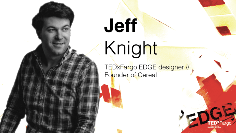
 Meet TEDxFargo’s historic annual graphic designer, Jeff Knight. Jeff is a local artist and the founder of Cereal, a creative studio specializing in brand enhancement. He is also the designer for all of the commercial TEDxFargo logos throughout the years! Keep reading to hear from Jeff himself on his design process for our anticipated 2023 TEDxFargo event, TEDxFargo EDGE.
 The idea behind the design grew from simply a word into a fascinating exploration of possibilities and ideas. It starts with the question of ‘where do we want to take this?’ – I say we, because it’s important to note how none of the design work would be as meaningful if it wasn’t for the EP team and their collaborative efforts to brainstorm ideas and ideate what ‘TEDxFargo EDGE’ would look like.
There were thoughts on one being ‘at the edge’ of something, but that seemed to imply danger. ‘Edge’ can also be sharp and cutting, like that of a knife. But we wanted to stay clear of the negative associations, the ones that are filled with fear and caution, and really venture down the path of what it is to instead – ‘Be Edgy’. This evoked ideas involving the ability to push boundaries, to the brink, and the ones that take us not just to the edge but over into something intriguing and mysterious.
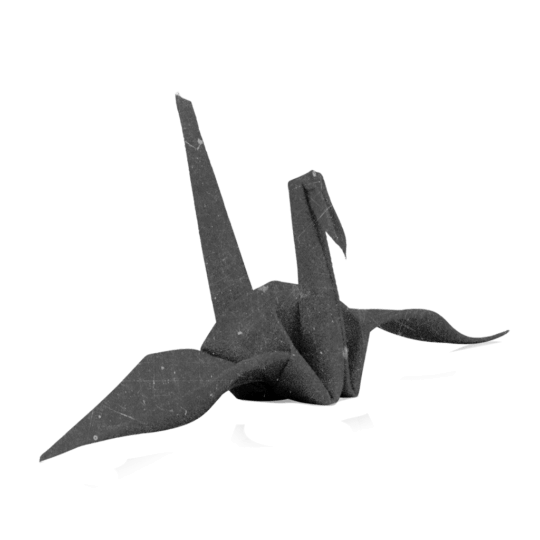
We talked about edges being folded like origami, or the ability to reveal what’s in the cracks between edges of surfaces.
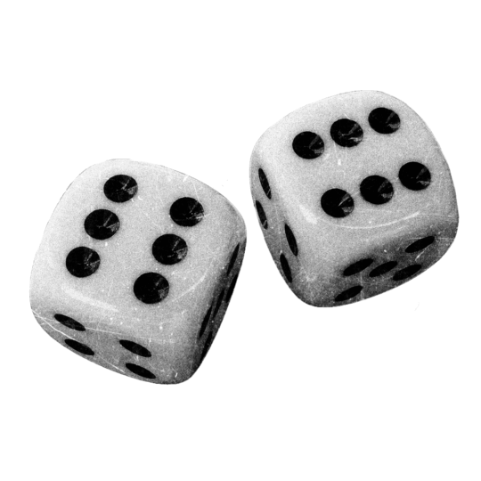
We even explored the idea of games and gambling being risks that we take, which led to visual cues of dice, cubes, and refracted light that enters the cube. That is how I arrived at the final design options.
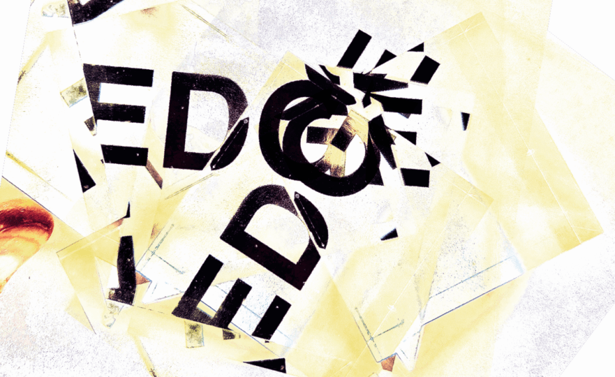
I purchased a small, clear, acrylic cube that refracted light and when physically placed on top of things allowed for a prism-like effect that distorted and reflected light in interesting ways. My phone camera caught the result and allowed for a great distortion of the imagery. This idea of grit and intensity was one we all associated with this year’s topic.
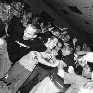
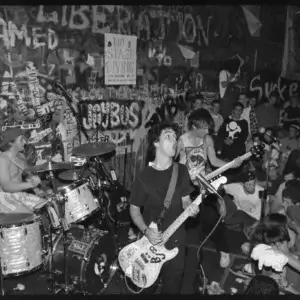
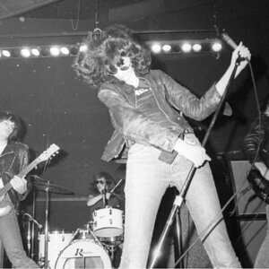
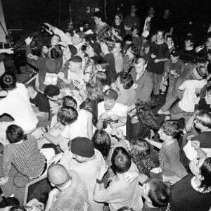
It also reminded us a bit of punk rock concerts of our younger years and while I’m keenly aware of the connection to punk’s ‘straight edge’ movement, this wasn’t meant to emulate that style at all, but to instead to look unlike anything TEDxFargo has done before in that it explored the extremes one could associate with a corporate identity system, like that of the TED global organization. It localized it. It could be pushed, composed, and broken by edges. Those edges make the identity something unique and force us to pause and investigate. It allows for elements to be removed and reconnected through experimentation and play.
Sometimes the design is a bit illegible, sometimes experimental, but it still maintains the main elements of TEDx branding and pushes them to the edge, just as I hope this year’s TEDxFargo talks will push you, the audience, as well.
JULY 20 2023 | 8 AM – 5 PM | FARGO CIVIC CENTER
FOR GROUP TICKETS, PLEASE EMAIL NATALIEL@EMERGINGPRAIRIE.COM

